
The Impact of Visuals
If any of these describe you, this is the post for you:
- Your images are okay, but could probably be improved
- You don’t have the time to invest in a creative team
- PPC Costs are killing you and you’re looking for another lever to move your business forward
- You haven’t changed your main image since it was first made
A few questions to get the juices flowing (try to think of an answer for the first two!):
- Why are we not taking our main images seriously even though it’s the absolute first thing everyone looks at when deciding what to buy?
- Unsure whether or not humans are visual creatures? Perhaps you can answer this: Why does the world have over 50,000 museums, 500,000 video games, and 5,000,000 movies?
- What’s the point of the game show “Family Feud?”
…
…
The point is this: It’s pretty hard to know what the majority of people think about a certain thing.
Why? Because they’re never asking an objectively correct question – like what is 2+2? (especially when asking people what they like about an image).
Thinking? Good! Let’s get started.
My promise to you: If you read this post and get actionable on improving your Amazon images you’ll make a lot more money. Period.
Before I get to the good stuff, here’s some extremely quick Click-Through Rate (CTR) math. The purpose of this is to show you the value in – what seems like – extremely small increases in traffic.
Let’s assume you have a product that you want to improve your main image on.
- The product currently sells $50,000 per year.
- It has a CTR of 6%.
- It is not a garlic press.
If your CTR is 6%, that means that 6% of the people who see your product listing on Amazon are clicking on it. Now…What would a modest 2% increase in CTR (traffic) do to our listing’s revenue?
CTR 6% -> 8%
=
This 2% increase in CTR is 33% more traffic!
That means – all other things remaining the same – your listing will go from making $50,000 per year to $66,667 per year. Insane!
What about 10%? $83,333.
What about 12%? $100,000.
At the end of the day, when 100 people view your listing, you’re just asking 2 more people to click it (or 4, or 6).
Seems simple, no? It is. How hard could it really be to get two more people to click?
The Basics
Table Stakes
- All images on Amazon must be zoom-friendly. That simply means all your product images must be at least 1000 pixels on the shortest side. But hey, why settle for the minimum? Try to make them at least 2000 pixels on the shortest side.
- Avoid blurry or “eBay 2005” type images – just NO.
- Always optimize for mobile before desktop. This is non-negotiable. Why? We’ll discuss that below.
- Choose jpeg over png for faster loading times.
- The product should fill at least 85% of the image frame.
The Power Humans Have
Now, let’s talk about the power of visuals…
Imagery and visuals are deeply rooted into human evolution; they aren’t just “pixels.”
Humans are quicker at processing images than text because quick visual recognition was essential for our survival. Those that noticed a threat quickly survived, and those that didn’t… well, you know.
Our brains are now completely optimized to receive and understand visual information. We evolved that way.
Nowadays, there isn’t much need for us to be giant image recognition machines in order to survive. We aren’t on the lookout for predators (the tigers aren’t lurking behind every bush). However, that doesn’t mean that we aren’t still hardwired that way. The big difference now is that society & technology have moved a lot faster than evolution.
The modern world is a lot safer and we can walk down the street without fear… but believe it or not, we’re still human.
Now, this efficiency in visual processing contrasts with reading, which, despite being a more “recent” development, requires significantly more “cognitive load” i.e., it’s more tiring for us.
All this is to say – to your buyer – images are really really important. And let’s go further: Your product images are the single most important thing. There simply is nothing that is going to be as impactful for your business as having excellent images.
Sorry, Copywriters
People just don’t read much (except you, right?). After numerous studies using eye tests – while looking at Search Engine Results Pages (SERPs) – it was discovered that not only do people scan/scroll quickly through the page but they also spend very little time reading the title or any other written words on the page. The vast majority of the time was spent scanning the main images in the SERPs.
Test, test, and then test again
We’ll talk about this more below. For now, just know that A/B testing is the not-so-secret sauce. A/B testing is when you test a control “A” version of an image versus a variation “B” version of an image to see which one customers prefer. It is essential for every Amazon listing.
I’m repeating this because it’s important: There’s no better way to increase the revenue to your product listing than improving your main image.
Many sellers have not changed their listing images in a significant amount of time. Some have never changed them. If you like money, I hope you’ll stick around for our deep dive into A/B testing.
Nobody is on their computer
Desktop usage is down significantly and mobile usage is up – and we’ll likely see that trend continue. If you navigate to your business reports on Amazon and look at the data, you’ll likely see higher mobile sales than desktop sales. For that reason, we need to make sure our images are mobile ready.
Optimizing Your Main Image
Why the Main Image is Crucial
Let’s start today’s lesson with a sobering fact:
Everyone has a phone and everyone is always looking at it.
Today we’re going to explore what this means for Amazon Sellers.
But first… perhaps you’ve been on Netflix or Prime Video recently. Ever notice how the movie/tv covers are a bit different than they used to be when you were a kid? Back then, the movie covers were cluttered, busy, and, most importantly, not mobile friendly (nobody had a cellphone, after all).
Take a peek at how this has all been optimized for mobile (Top is then, bottom is now).
The covers have a bigger, bolder hero – large text, less cluttered. This kind of image is really good for people sitting far away from a screen (TV), or those on their mobile device. Pretty neat, hey?
We want to optimize for mobile first. Why? Because most people shop on their mobile device (Duh!). So, how do we do that? What does it mean to make our images optimized for mobile?
Well… we want to make our images, icons, and any text on those images clearly visible since only the thumbnail shows up in the SERPs. We want them to POP!
To help us uncover what makes a great mobile image, let’s get started with the “4W’s” as defined by this GS1 Guideline: Who, What, Which, and HoW. Each of these 4Ws should be present in mobile optimized images.
- Who: What brand name is it?
- What: What product is it?
- Which: What variety is it?
- HoW: How much is there?
The 4Ws are essential on a mobile image because of this: There are three main types of shopper behavior – Brand led, Value led, and Specific product led. And the 4Ws answer each of those types of shopper behavior, and all of them have the same denominator – images. In a nutshell, if you stick to this guideline, you’ve got all your bases covered.
Also, anything on an image that does not answer one of these four questions should not be included. Snip, snip, snip! The reason is that there is extremely limited space on a main image, and so, we must convey the most essential information that a buyer would use to make a decision.
Setting your main image up in this way can dramatically improve how your product is perceived at a first glance. It’s important to remember that you may think people shopping online are giving you their full attention or are able to see the screen clearly, but let me promise you, they aren’t.
Some of your buyers are likely:
- Distracted
- Visually impaired
- Old
- Multitasking
- Outside somewhere that makes the phone screen harder to see
- Holding their device far away from their face
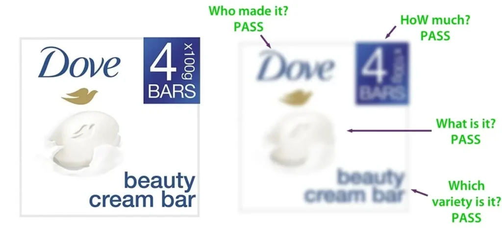
As mentioned above, we need to make our image simple, clear, and concise. Again, simplicity reigns supreme. This brings us to the Clari-Fi Test from Cambridge University. The test uses blurring to simulate the challenges of viewing small icons, images and text on mobile screens.
If the elements in the blurred main image can still be seen and understood, they pass the test (and are then mobile ready).
The test serves as a crucial indicator of our success in highlighting the primary motivations for purchasing a product to the customer. Should these motivations become impossible to see under blurring, it signals a significant issue: they are neither big enough or clear enough (or both).
Have a look at the below example:
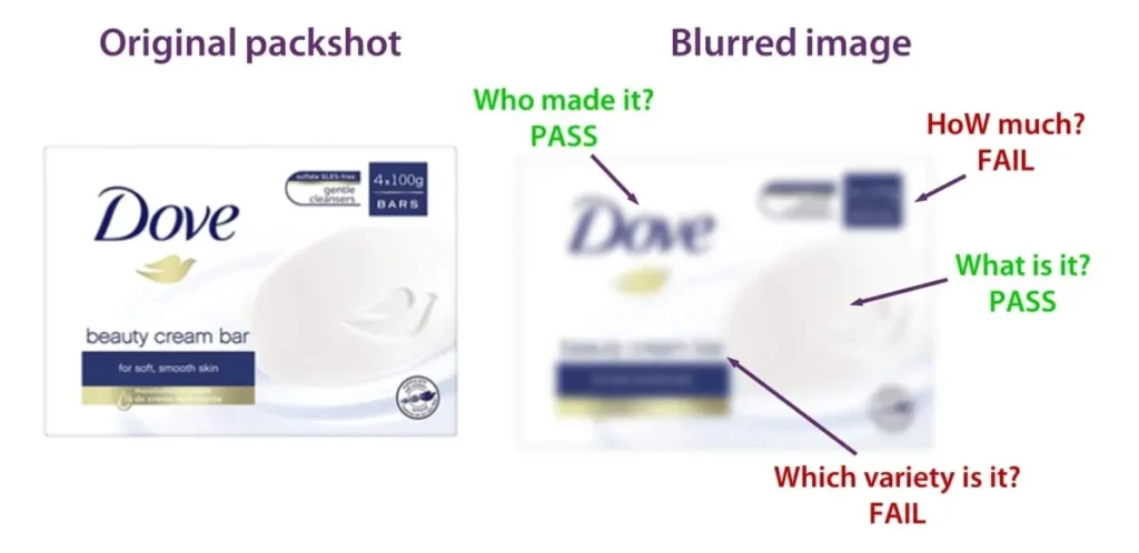
We’ve got a package of Dove soap. In the original packshot, we can clearly see that there are elements on the packaging that are quite small. When we blur the image, they become impossible to see. Some elements are still visible, like the “Who” (Dove) and the “What” (Soap), but “How” and “Which” fail the test.
In the second image, the item has been optimized for mobile search. Everything is bigger, bolder, and when you apply the same blur to it, all of the elements are still visible and understandable.
Where’s the value?
Changing to a mobile-ready image has a ton of added benefits:
- Make it easier for people to find what they’re looking for (Easier navigation)
- Boost sales across all types of devices (Increased sales)
- Cut down on mistakes where shoppers add the wrong item to their cart (Reduced errors)
- Reduce time spent on design for brands, retailers, and agencies (Less design time)
- Make sure things are shown in a more uniform way (Consistent presentation)
- Make the pictures of products look better (Enhanced product appeal)
- Reduce returns, & customer unhappiness (Fewer returns)
- Be optimized for an expanding market (Prepared for mobile)
A Few More Excellent Things to Try:
- If there’s a search term you’re trying to target, make that the biggest and boldest part of the image. Customers typing in search term will be instantly rewarded by seeing the exact phrase represented in the image.
- 3D Renders are a great way to show a crisp clean image without artifacts or blurring
- Changing the main image to be more mobile friendly – within reason – is not black hat (even if the actual product looks slightly different). Remember, Amazon likes money and obsesses about – more than anything else – the customer experience
- If the main image you upload gets suppressed, simply upload your old one or make edits to your new one and try again
- Use big, bold letters and bright, vibrant colors
- There are additional things you can test inside of a main image that go beyond the scope of the 4W’s and may have some value.
- Clear benefit/callout on a non-existent hang tag
- Lifestyle Images (Images that are not a white background, but instead show the product in-use)
- Add-ins (images that have extra stuff, not just the product as is)
Navigating Amazon’s Terms of Service (TOS)
Amazon’s Main Image Guidelines
Let’s look at Amazon’s Terms of Service.
There’s a LOT of super interesting (and vague) language in the TOS. BUT – before we get into it, I want you to remember two very important things:
1. Amazon wants their customers to have a wonderful experience.
2. Amazon wants to make money.
Now that we have that out of the way, let’s talk about the main image requirements. Among other things – according to Amazon – your MAIN image must:
- Have a pure white background
- No text, logos, borders, color blocks, watermarks, or other graphics
- Show the entire product
- No accessories or other props that might confuse the customer
- No packaging unless its an important product feature
And yet…
- Not only does Amazon stress about being customer obsessed, they strive to be “Earth’s most customer-centric company.”
- Would Amazon force sellers to have compliant images if it led to a worse customer experience?
- A large volume of main images on Amazon violate their image standards in one or more ways.
- Why would so many main images remain live if they violate TOS?
- Amazon’s single TOS is supposed to apply to all products.
- Are there unique products that might be better pictured without following TOS?
- Having a main image violation is not a big deal. The image gets suppressed and then we can upload the old one and try again.
- Why would the penalties for a main image violation be so light?
And most importantly:
- Amazon is not policing “main image violations” in any meaningful way.
Hopefully, you’re reading between the lines here: Not only are the penalties negligible, Amazon is not actively taking down “violating” images. They know that sometimes an image that isn’t exactly following TOS may lead to a better customer experience.
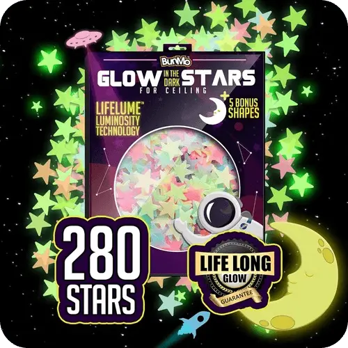
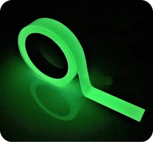
Let’s look at a few:
- Glow in the dark products are better displayed with a dark background:
Mobile-ready images that have large, clear callouts offer a better experience to mobile buyers. Check this listing out. (even though they are technically breaking TOS).
Remember the 4Ws?
- Who: What brand name is it? Magnum
- What: What product is it? Ice Cream
- Which: What variety is it? Double Caramel
- HoW: How much is there? 3-Pack
- Transparent or translucent items often are displayed better with accessories that are not included or with non-white backgrounds:


- Lighting is more clear as a lifestyle image.


- Adding in Accessories – does having the pizza make it more clear or less clear what the image is?
Is having the pizza inside of the image confusing the customer?
Do they think they are actually going to receive pizza with the container?
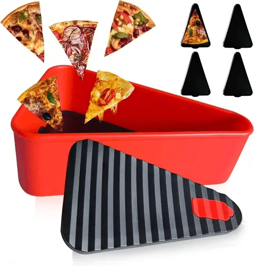
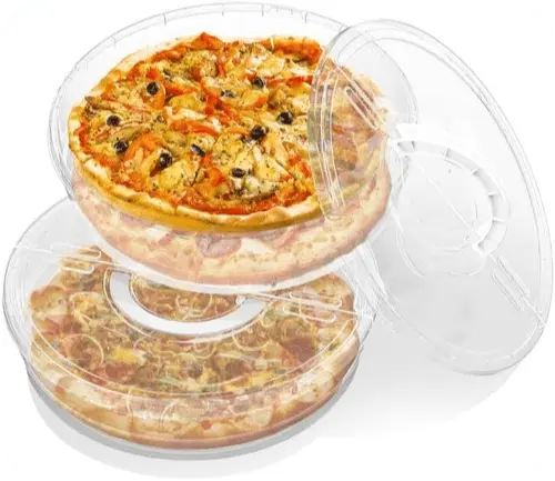
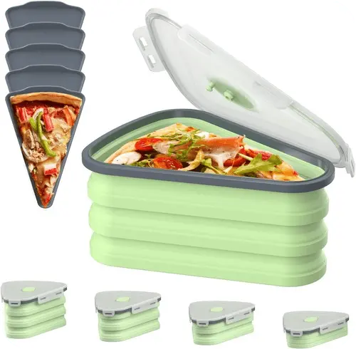
These are just a few examples of what are millions and millions of main image “violations.”
So, ask yourself: is your image purposely breaking TOS to be click-baity, without providing value?
OR
Are the changes you’re making actually improving the customer experience?
In my experience, there are very few click-baity type images on Amazon (although they are trying to get clicks), and the vast majority are violating images that make the product more clear and lead to a better buying experience.
If it’s not clear by now, following TOS may lead to a poor buyer experience. So, let’s break main image TOS with impunity.
The Power of A/B Testing
What am I, a scientist?
A/B testing, also known as split testing, is a method used to compare two versions of something. This could be a main image, a title, the A+ content, or other part of an Amazon Product Detail Page (PDP).
To complete the test, we need a version ‘A’ (control) and version ‘B’ (variant). These are then shown to different groups of people at the same time. Then, we look at which version does better based on our specific goals.
If we want to increase Click-Through Rate (CTR), we test:
- Main Image
- Title
- Price
If we want to increase Conversion Rate (CVR), we test:
- Secondary Images
- A+ Content
- Bullets
Why are we focusing on different metrics? Well, there’s one main reason: since only the title, price, and main image are visible in an Amazon SERP, we can only focus on CTR. Why? There’s no way to purchase from a SERP so CVR doesn’t matter yet. Therefore the main thing we can look at is CTR.
Once people get to the listing, we can focus on CVR more seriously.
Time to Family Feud This Sh*t
The process is straightforward but powerful. First, we identify a goal or improvement area. Next, we create two versions of the attribute (image, copy, etc.) that differ in some key way.
Half of our audience is then shown the original version (A), while the other half sees the modified version (B). By comparing user behavior between the two groups, we can make data-driven decisions about which elements contribute most effectively to our goals.
A/B testing allows us to make incremental changes while – and this is the important part – minimizing guesswork and biases. It’s a cornerstone of data-driven decision-making and can significantly improve user experience, engagement, and conversion rates.
I promise you… You won’t know what’s best until you test (hey, that rhymed!).
That was so good let’s repeat it:
You Won’t Know What’s Best Until You Test
How you can be as good as Mr. Beast (Split Test the Right Way)
Guess how many main image thumbnails Mr. Beast tries per YouTube Video?
I’ll give you a hint: It’s more than 1.
- Make bold changes. Tiny/minor changes likely won’t move the needle enough.
- Let the data decide. Your best friend’s opinion doesn’t matter, and neither does yours.
- Iterate each version forever (or at least for a while).
- Fail fast and try something new – speed is how you win.
- Avoid MYE (Manage Your Experiments) – too slow, not enough good data.
- Get curious, think outside the box.
- See what top sellers are doing and copy them.
- 80/20 – focus on your bestsellers first for testing.
- 80/20 – focus on your worst content first.
- Understand diminishing returns – if something is very good, it’s higher ROI to turn something from very bad to very good versus very good to wonderful.
- Try tests in two main ways: Refinement Vs Exploration (more on this below)
- If you don’t have traffic to your listing, get that first. Testing two versions won’t matter if noone is coming to your listing.
- Split testing never ends
Who Should You Take to the Dance?
There are plenty of places to A/B test your Amazon products. Here’s a few:
Manage Your Experiments (MYE)
Method: Two unique groups of Amazon buyers are shown different versions of your offer simultaneously.
Audience: Amazon Customers
Price: Free
Speed: Slowest
Eligibility: Only high-traffic ASINs
Jungle Ace
Method: Single Keyword Campaigns (SKC’s) in PPC that measure CTR & CVR. One version of the content is shown first up to a certain amount of clicks, and then the next version for the same amount of clicks when the first is done.
Audience: Amazon Customers
Price: Low – flat monthly fee
Speed: Fast – most tests are done in 5 days to 15 days
Eligibility: All ASINs
Test Varieties: Low
Intellivy
Method: Private group of buyers who are paid $ to answer short surveys/tests.
Audience: Potential to be Amazon Customers
Price: High – monthly fee + per response pricing
Speed: Fast
Eligibility: All ASINs
Test Varieties: High
Pickfu
Method: Private group of buyers who are paid $ to answer short surveys/tests.
Potential to be Amazon Customers
Price: High – monthly fee + per response pricing
Speed: Fast
Eligibility: All ASINs
Test Varieties: High
ProductPinion (MY FAVORITE)
Method: Private group of buyers who are paid $ to answer short surveys/tests.
Potential to be Amazon Customers
Price: Medium – monthly fee + per response pricing
Speed: Fast
Eligibility: All ASINs
Test Varieties: High
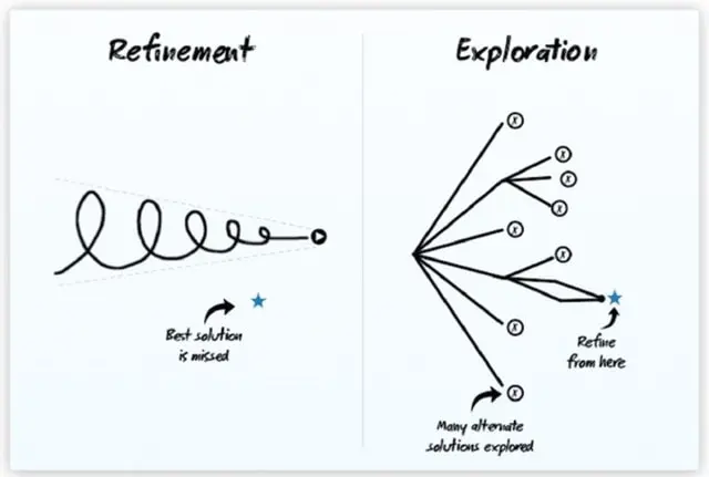
Refinement vs Exploration
Let’s explore the two ways to test: Refinement vs Exploration.
Here’s how it works: Bob has always loved chocolate chip cookies. He loves them so much that he bakes them all the time. He’s constantly tweaking the levels of his ingredients – a little more flour here, some salt there, but the basic idea is the same. Bob’s trying to refine the recipe to be absolutely perfect.
One day, Bob takes a bite of a cranberry and is inspired. He tries an entirely new form of cookie. Bob decides to add cranberries and white chocolate to a cookie instead. Bob is exploring an entirely new way to make a cookie.
The difference between these two approaches:
Refinement attempts to take what we already have and make small changes and tweaks to make it better. The other explores, experiments, and tries something totally new. Both are completely valid ways of A/B testing your main images.
Refinement sometimes misses entirely new, unique ideas as the technique attempts to iterate on one main idea only. Whereas exploration can often yield extremely interesting and unique results, but often won’t yield the most optimized main image (if there even can be such a thing).
Both approaches to A/B testing are complimentary.
As a general rule:
Begin with an exploratory technique. Try wildly different ideas for your images. Then, refine and refine until you have something wonderful.
Let’s look at an example:
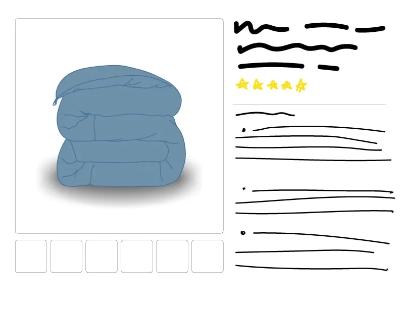
Here we have a blanket. What would A/B testing look like from both a refinement and exploration point of view?
Refinement: We are refining the main image to make it as good as we can by iterating on our original design and adding (or subtracting) certain elements.
Version A: The blanket without any changes on the Amazon product detail page.

Version A1: The blanket with a drop shadow.
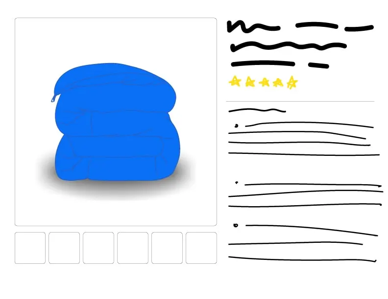
Version A2: The blanket with a drop shadow and a color/hue adjustment.
Version A3: The blanket with a drop shadow and color adjustment, and then enlarged.
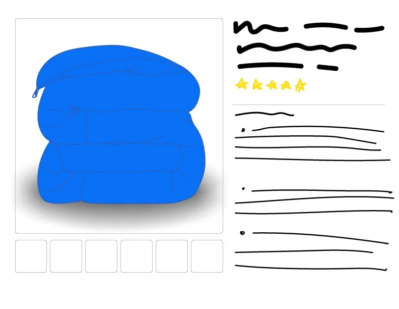
If we look at how this compares to the original image, there’s a good chance that this main image will have a much higher CTR. It’s bigger, bolder, and stands out.
Scroll up and take a look how this looks compared to our starting point: Version A.
We’ve done a good job at making this image way better. But there’s always another question to ask:
What if this isn’t the most optimal way to show this product?
Yes, we’ve improved our original version, but maybe we should be showing this product a completely different way?
So… enter experimentation:
Version B: The blanket is shown on a bed as a lifestyle image.
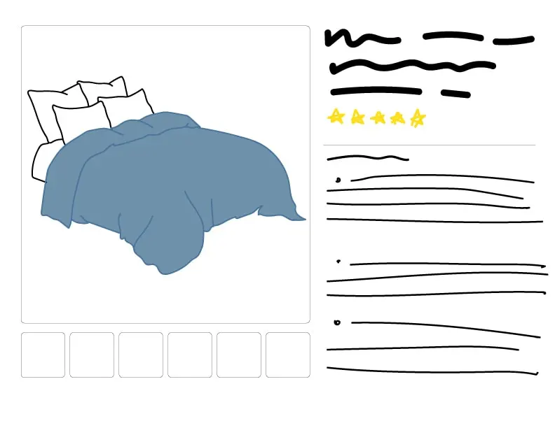
Now we’re showing the blanket actually on the bed. Will this yield a higher CTR? I’m not sure. But you will, when you test it!
From here we can continue to experiment, iterate, experiment, and iterate some more. You’ll probably never get to the “perfect” image, and that’s okay.
Final Thoughts
You learned a lot!
- How to do CTR math and how much it matters
- Why your main image is the best way to improve your revenue
- What it means to have a mobile-ready image
- Which secondary images are best for your unique listing
- What Amazon’s Terms of Service means for you
- How, where, why, and what to A/B test
At the end of the day, what matters is that you’re testing and trying new main images. It doesn’t matter what software you use or how you test – what matters is that you actually try new images and optimize for your ideal customer profile.
Thanks for taking the time to read this!